Choosing Colours
An Interview
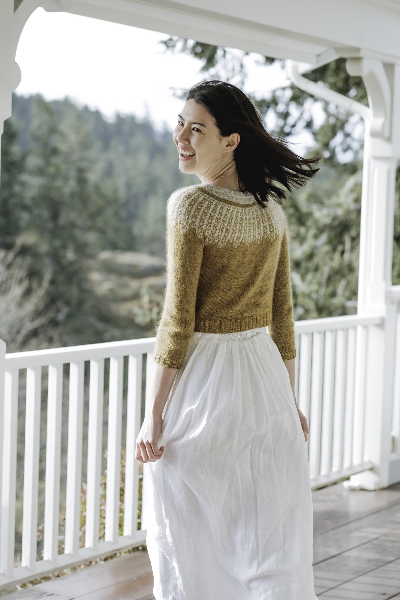
I’ve loved working with Julie Asselin yarns (check out my Dissent Pullover in Anatolia held together with Nurtured Fine) and you’ll find two of them referenced in KnitOvation’s yarn exploration chapter. Recently they asked me some questions of choosing colours for colourwork and I’m delighted to have this post hosted both here on my website and as a guest post over at theirs.
I’m looking forward to delving into how I pick colours, but first:
Julie and I had a live chat on YouTube! You can watch it here.
They’re having two giveaways for my two stitch dictionaries! These haven’t gone live yet, but they’ll be on Instagram, so be sure you’re following them there.
AlterKnit in French! Julie is in Quebec, she and a lot of her audience speak French, so I’ve set aside a French translation of AlterKnit to give away just for the French speakers! (If you’re curious about translations, check out this page.)
KnitOvation — this one hasn’t been translated from English yet because it’s so new, so I’ll give away a copy of the English edition.

A stack of colourwork knitted swatches in shades of gold, grey, purple, and brown on a white background. These are just some of the swatches I knit for the Yarn chapter of KnitOvation.
On to the Interview about Picking Colours!
JA Team:
After choosing the right yarn, choosing colors is an important step when starting a colorwork project. This is not an easy skill to master when you are a beginner to colorwork knitting.
How do you select your color combinations for your projects?
Andrea:
Choosing colours is a very personal process and my first priority is to find a combination that suits the mood for the project and that brings joy. So step one is to take a quick look through the colours available and pick any that stand out, without being too particular on that first round. It’s not about what’s in style, what my wardrobe needs, or picking colours that I think will go well together at this point, rather going with a gut feeling of colours that are pleasing.
I usually pick colours from a computer screen rather than in person, but this works just as well in real life. I like to save the images of colours I like to my iPad so I can play with my options and if you’ve got actual yarn in front of you, like if you’re in a yarn shop, I suggest making a pile of the ones that excite you.
Once a pool of colour candidates is in place, it’s time to make some choices. Most of my designs and projects are just two colours, so I’m often looking for two colors that contrast well. But if you want to have a whole palette, I suggest breaking it down first into 2-colour options. Most of the time you’ll be working with just two colours at a time, so you need the colours that are worked in the same round to have good contrast with each other. Once you have sets of those 2-colour combinations, then you can start to combine them with other 2-colour combinations for a full palette if you’re wanting to work with a bunch of colours.
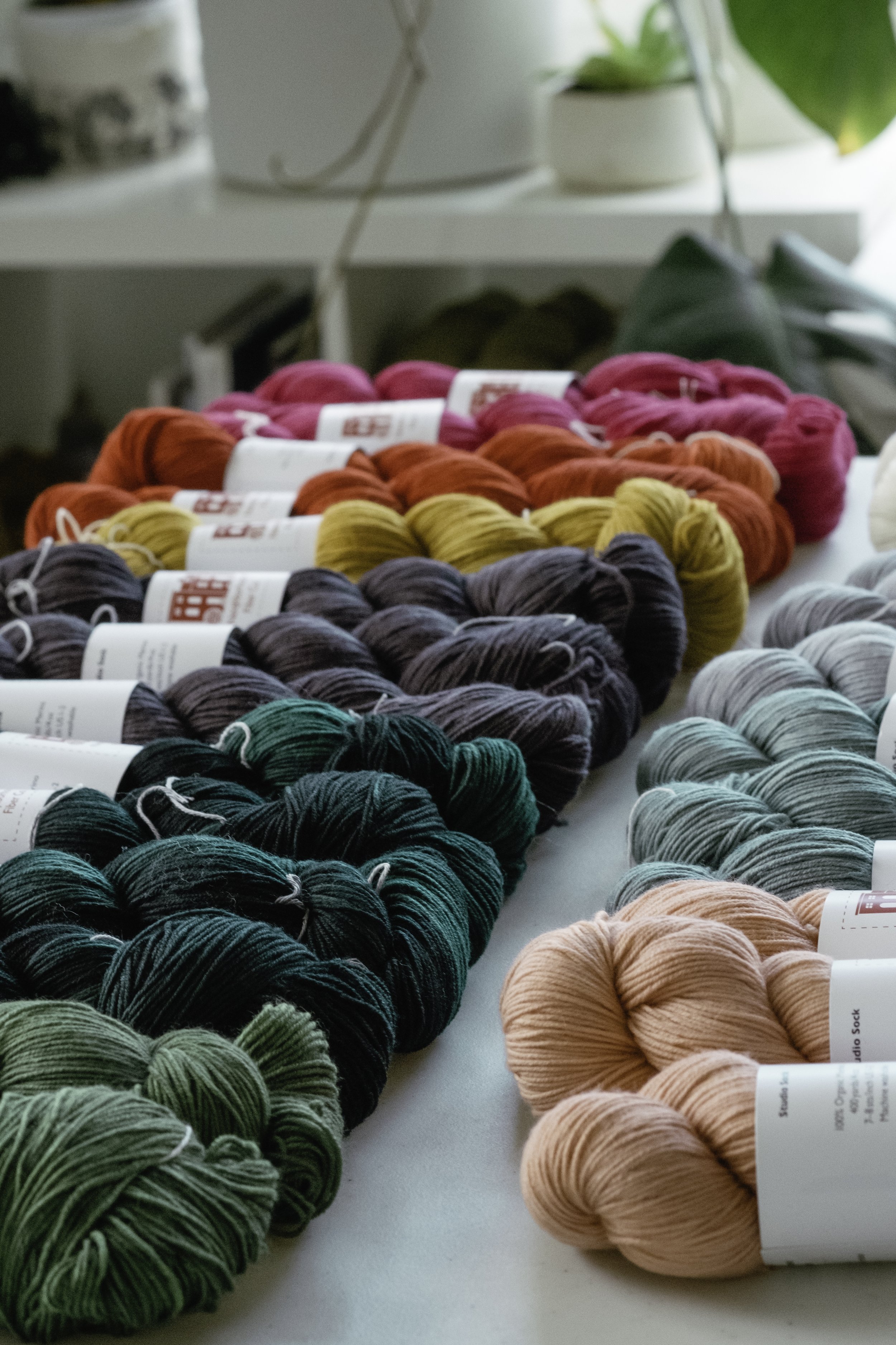
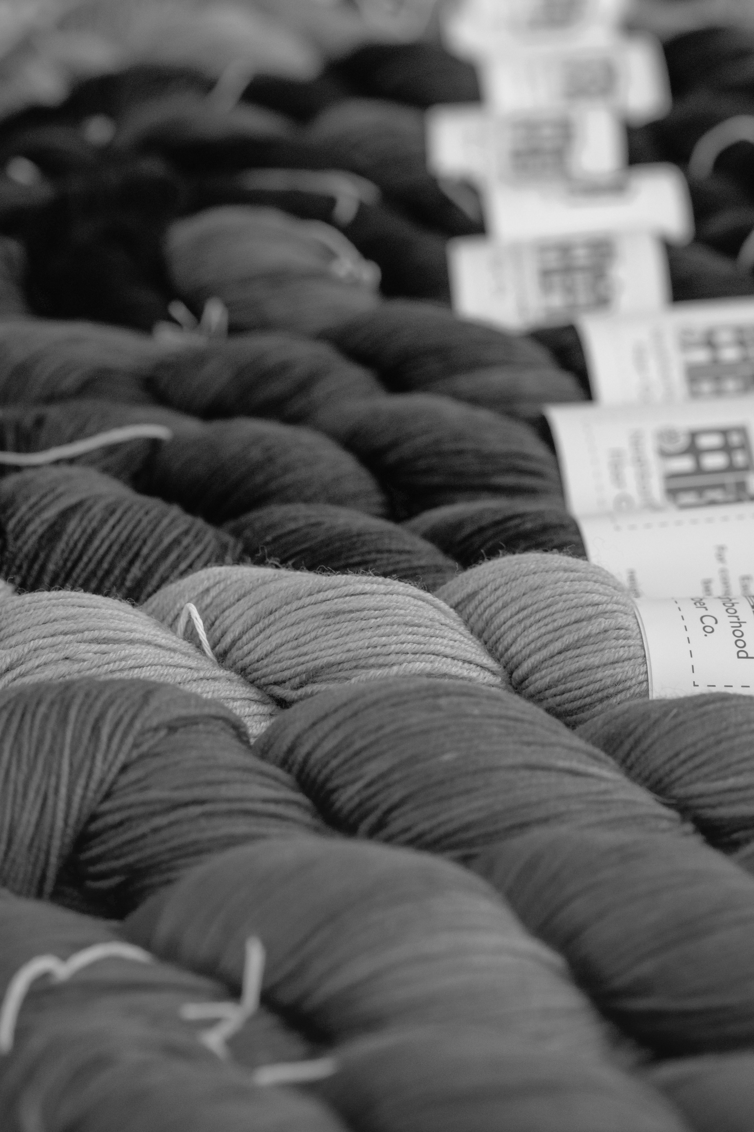
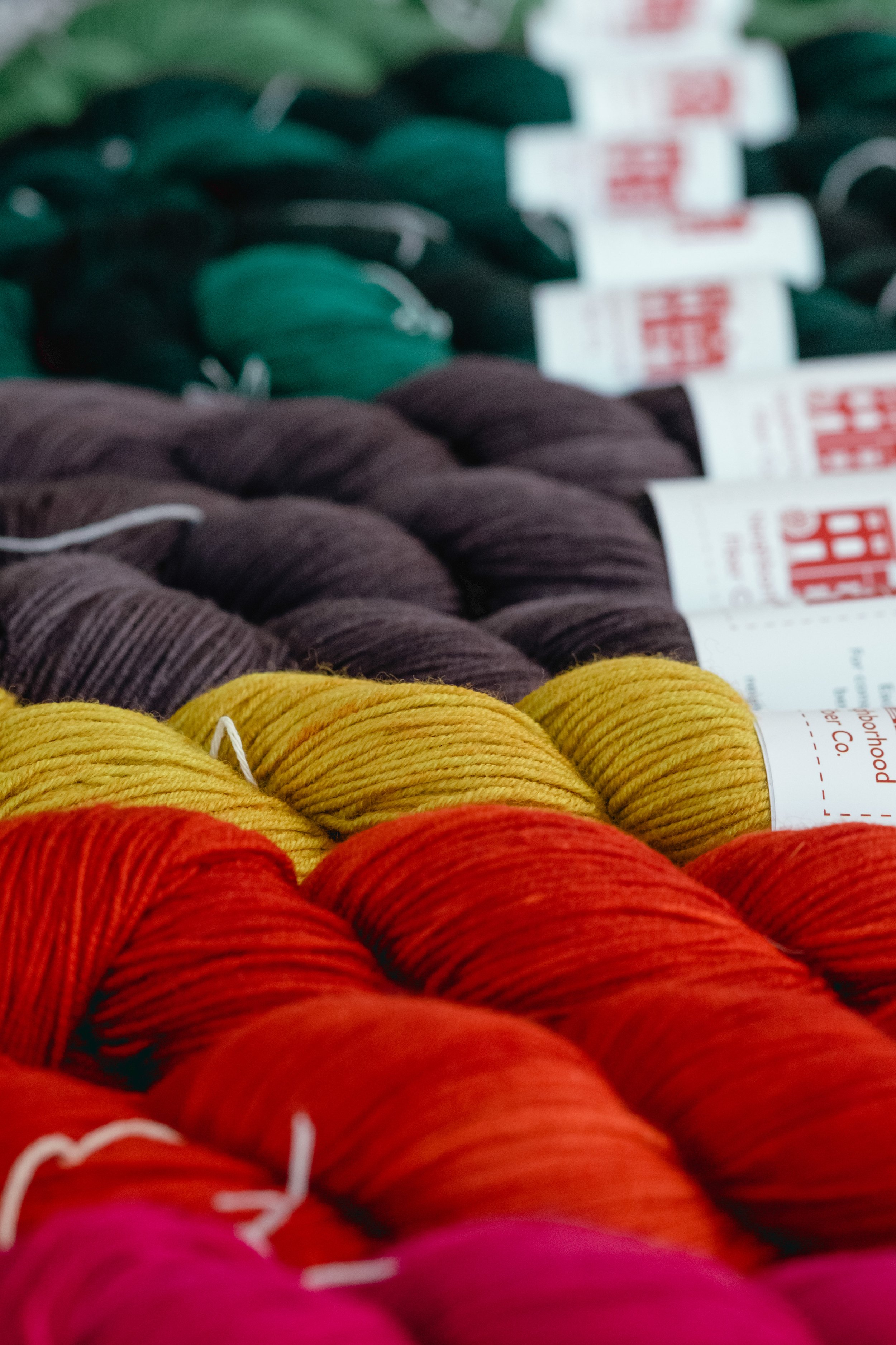
So many skeins of yarn are set out on a table in rainbow order with dark shades on the left and light shades on the right. The yarns on the left will only be paired with the yarns on the right to be sure there’s enough contrast between the colours.
JA Team:
What are the important things to have in mind when putting colors together?
Andrea:
The 2 main things to keep in mind when putting colours together are:
Do you like it?
Do the colours have enough contrast that they stand out from one another?
The first is completely subjective and I encourage you to go with what feels right to you, regardless of what you think other people might feel about it.
The second is trickier than you might think, but there’s an easy test that can help before you even cast on for your swatch. More on that in a minute.
For the pattern to really stand out, pick one very dark colour and one very light one. What matters here is not the shade of the yarn, like red, orange, or blue, but how light or dark it is. That’s called colour value and it’s what will determine how much your pattern will stand out from the background. If both colours are very light or very dark, the pattern won’t show at all. If one colour is very light and one is medium value, you’ll get a visible pattern that’s more gentle, less popping, same with if you have one colour of medium value and one very dark. The closer the shades are to each other, the less the pattern will show.
But value can be difficult to distinguish, so here’s a trick to easily discern if one yarn is light, medium, or dark compared to another. Just look at them together in black-and-white!
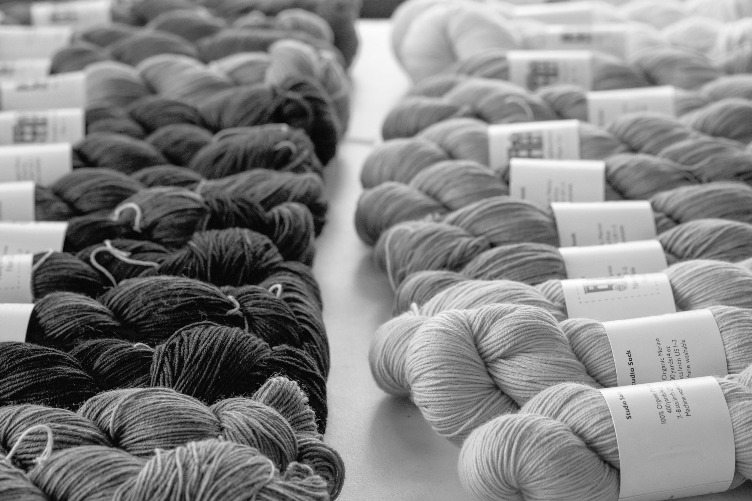
A black-and-white photo of a lot of skeins laid on a table with dark yarns on the left and light yarns on the right.
If you’ve got images saved on your phone or tablet, make copies (being sure you know which one is which) and edit the copies with a black-and-white filter.
Or, if you’ve got yarn in front of you, take photos of your possible combinations either in black-and-white, or edit them after to make them black-and white.
The more different your two yarns are in black-and-white, the more likely your pattern is to stand out against the background. If they both look like the exact same grey, the pattern will probably get lost, even if the shades are very different from each other. I had this happen with a light grey and a neon green. They looked nothing alike in the skeins, but the values were so similar that the pattern almost disappeared.
Black-and-white closeup of a bunch of skeins of yarn in shades of white and pale grey.
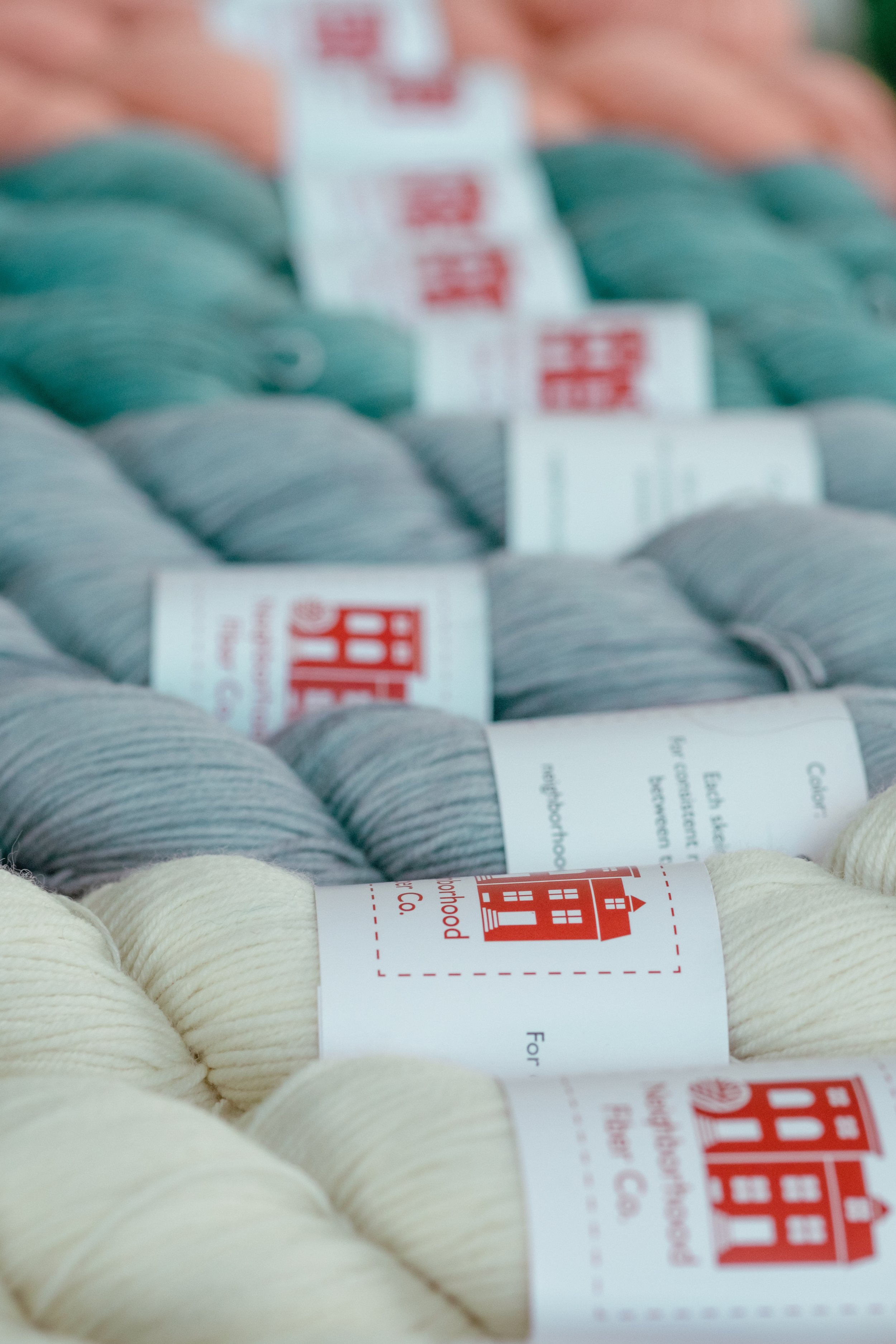
The same photo as before, but in colour so you can see that there are white, pale grey, pale teal, and pink skeins.
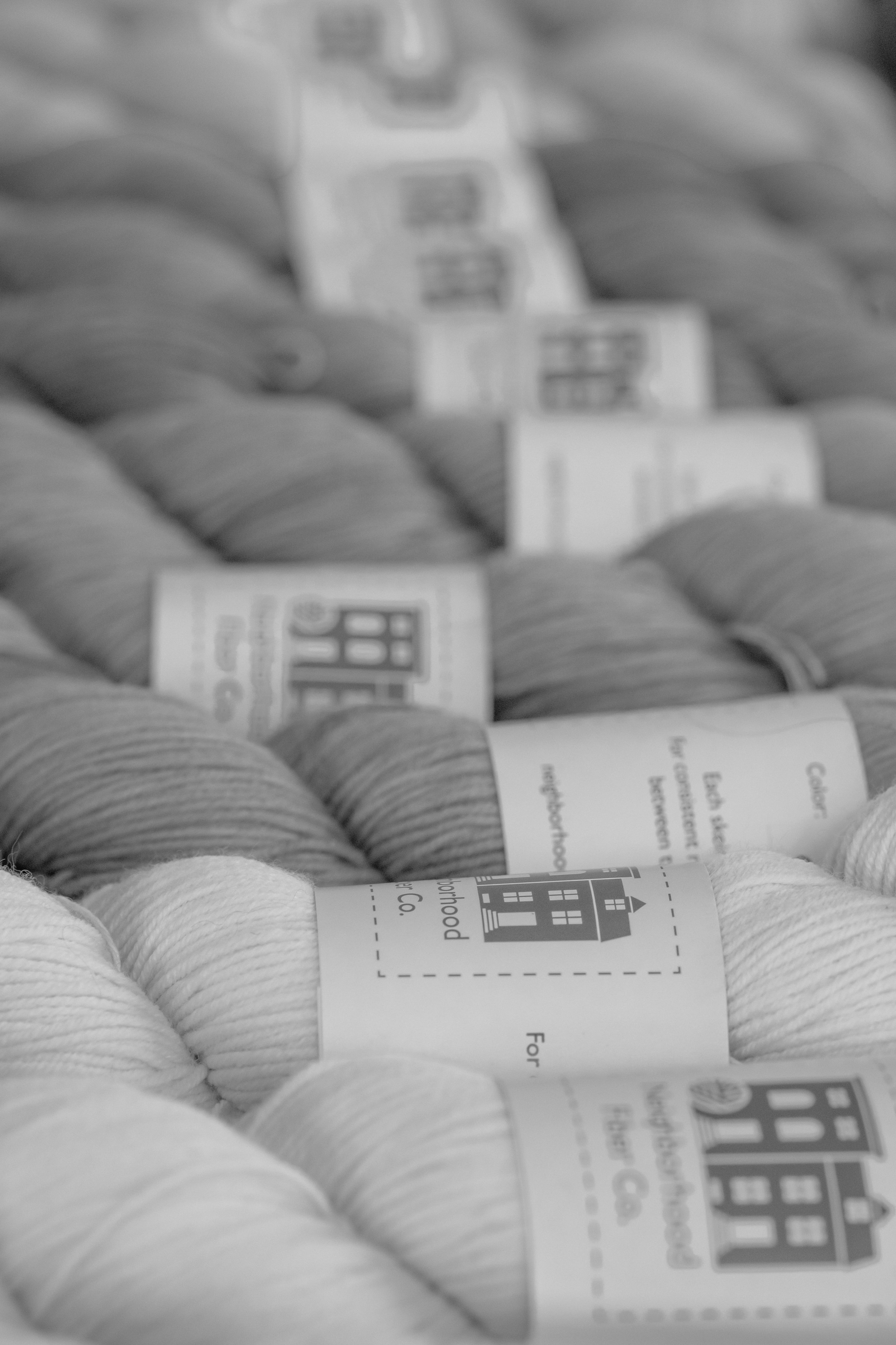
Black-and-white closeup of a bunch of skeins of yarn in shades of dark and medium grey. There’s one in the middle that’s paler than the rest.
The same photo as before, but in colour so you can see that there are red, yellow, dark grey, and green skeins.
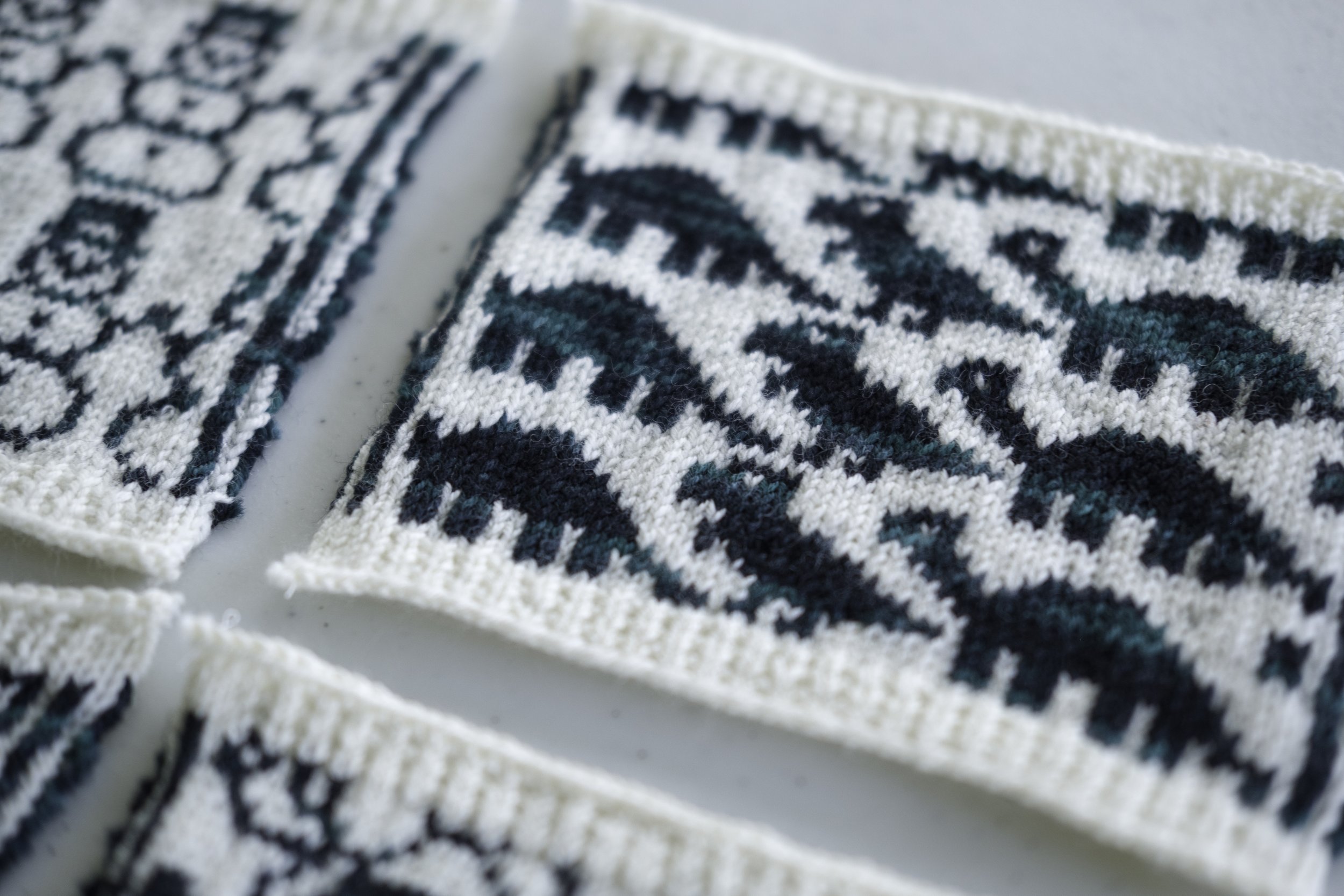
One more thing to consider is the motif itself. Are there delicate, single-stitch lines or mostly big sections of bold pattern? The more delicate your motif, the more important it will be for your colours to have a lot of contrast. This is, of course, a matter of personal preference too. Do you want a soft, washed-out look? Or are you looking for a bold motif that will really show the pattern?
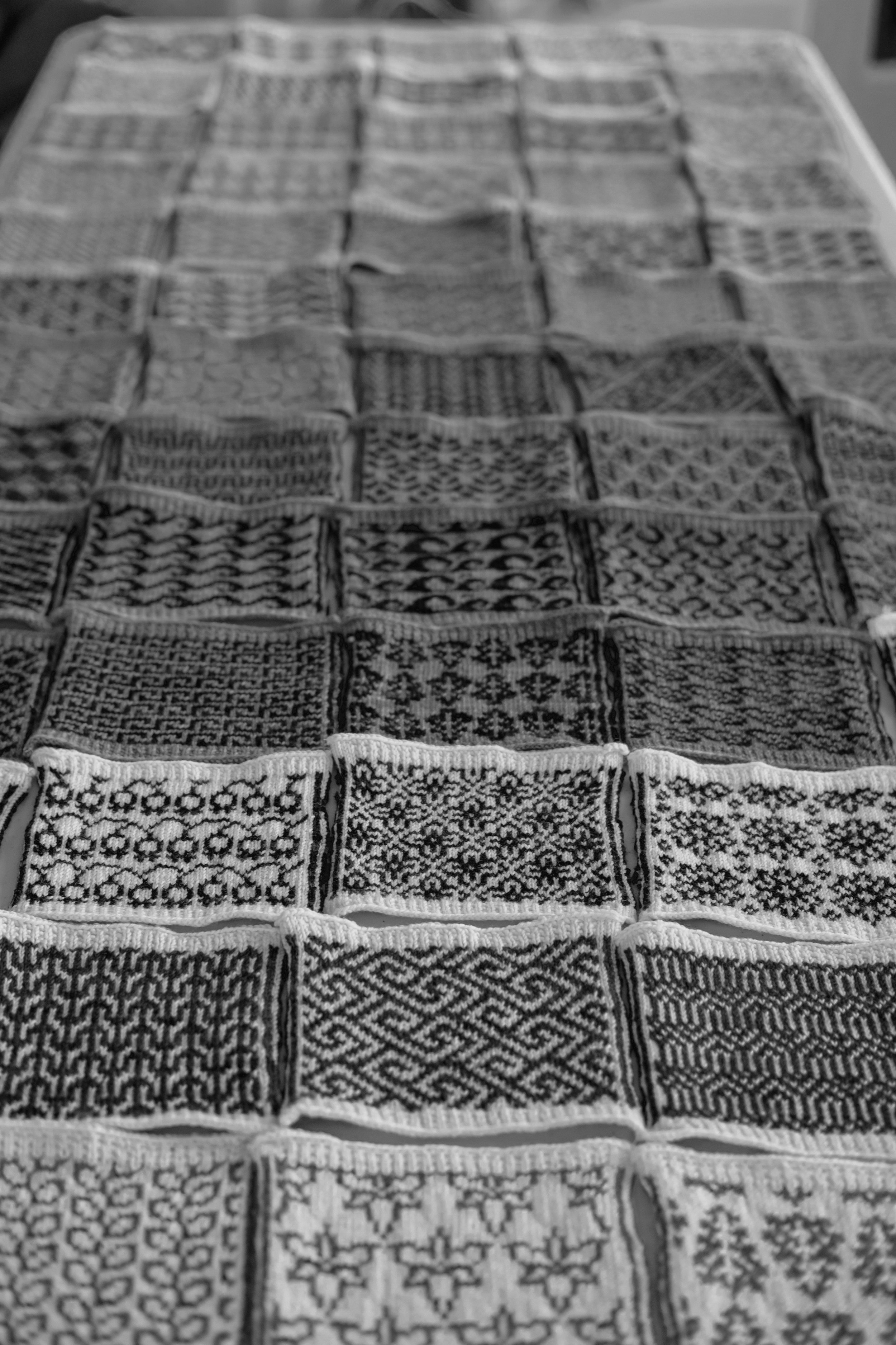
Black-and-white photo of colourwork swatches in various motifs covering a table.
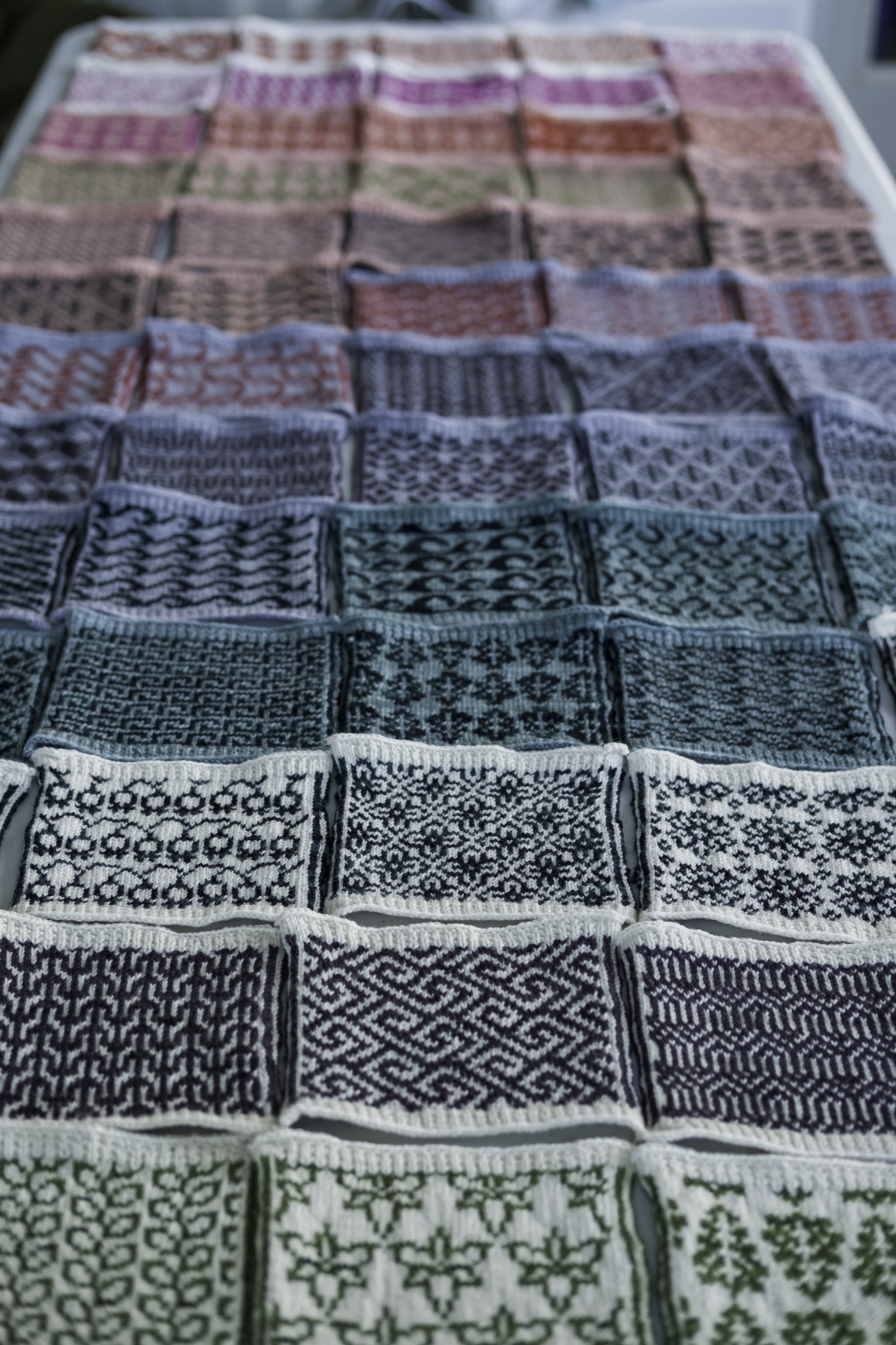
The same swatch photo as before, but in colour so you can see that there are swatches in white paired with grey and green, dark teal paired with light teal, dark grey and light grey, and reds, pinks, and greys blurring into the background.
JA Team:
Different dyes techniques have an impact on color. How to take that into consideration when choosing colors for a colorwork project?
Andrea:
Yarns may be completely solid, semi-solid, heathered, variegated, or even speckled.
For bold, clean colourwork, solid colours are ideal. Heathered yarns work in a similar way, though I find them to be a little earthier.
Semi-solid yarns create colourwork patterns that are less crisp, but they offer beautiful layers of richness and depth. They give a more watercolour look than solids, which I find really enticing, but it’s definitely a different look and the pattern won’t be quite as clear.
Knitted swatch of adorable dinosaurs. The background colour is white and the pattern colour is semi-solid dark teal. This combination is very crisp even though the pattern colour is semi-solid because one colour is so light and the other is so dark.
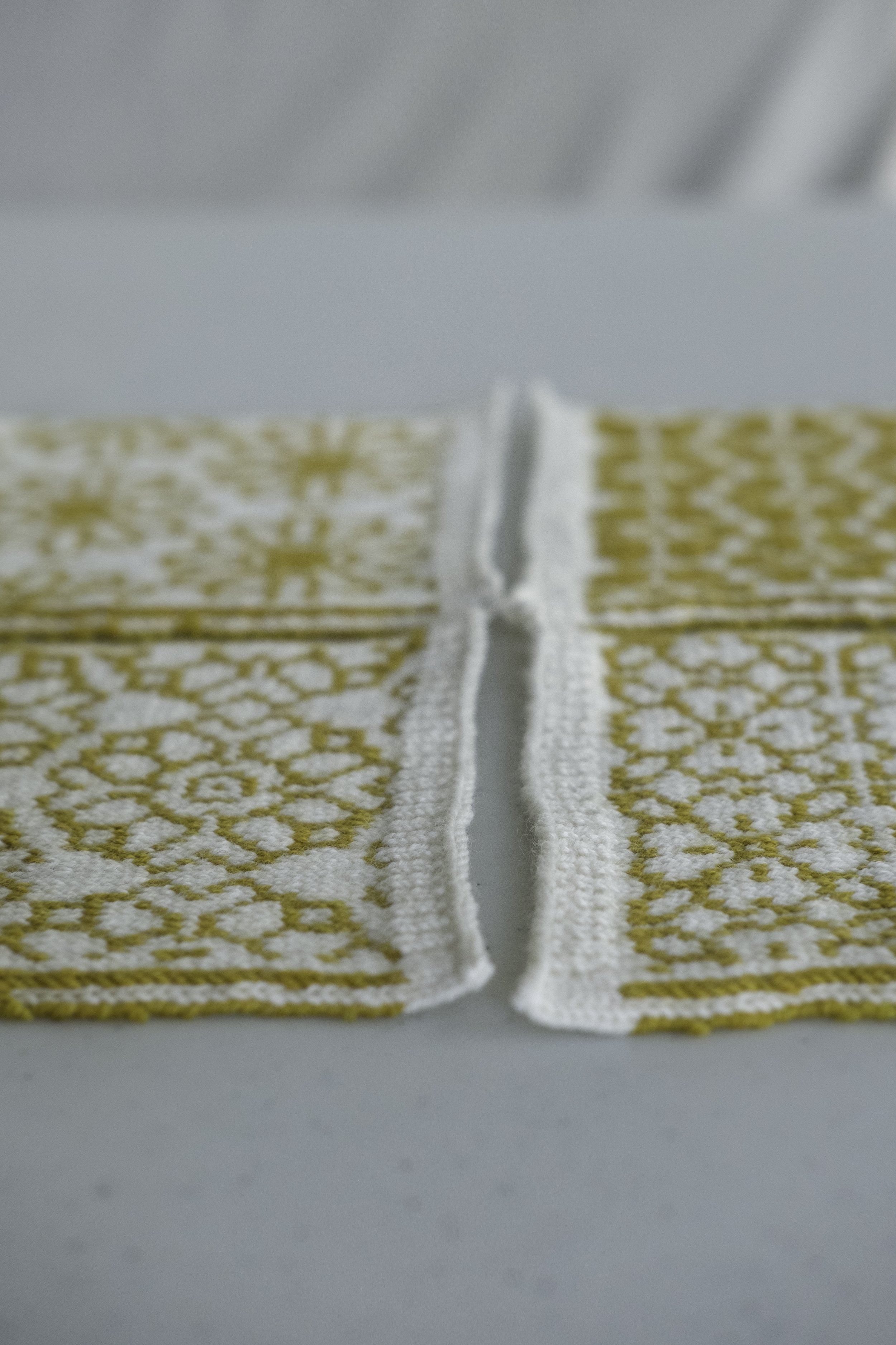
White and yellow floral swatches on a white table. White was the only colour that was a good pair for the yellow because it was more medium value than dark.
Light and dark teal swatches showing two semi-solid colours worked together. The pattern looks good because the values of the yarns are highly contrasting.

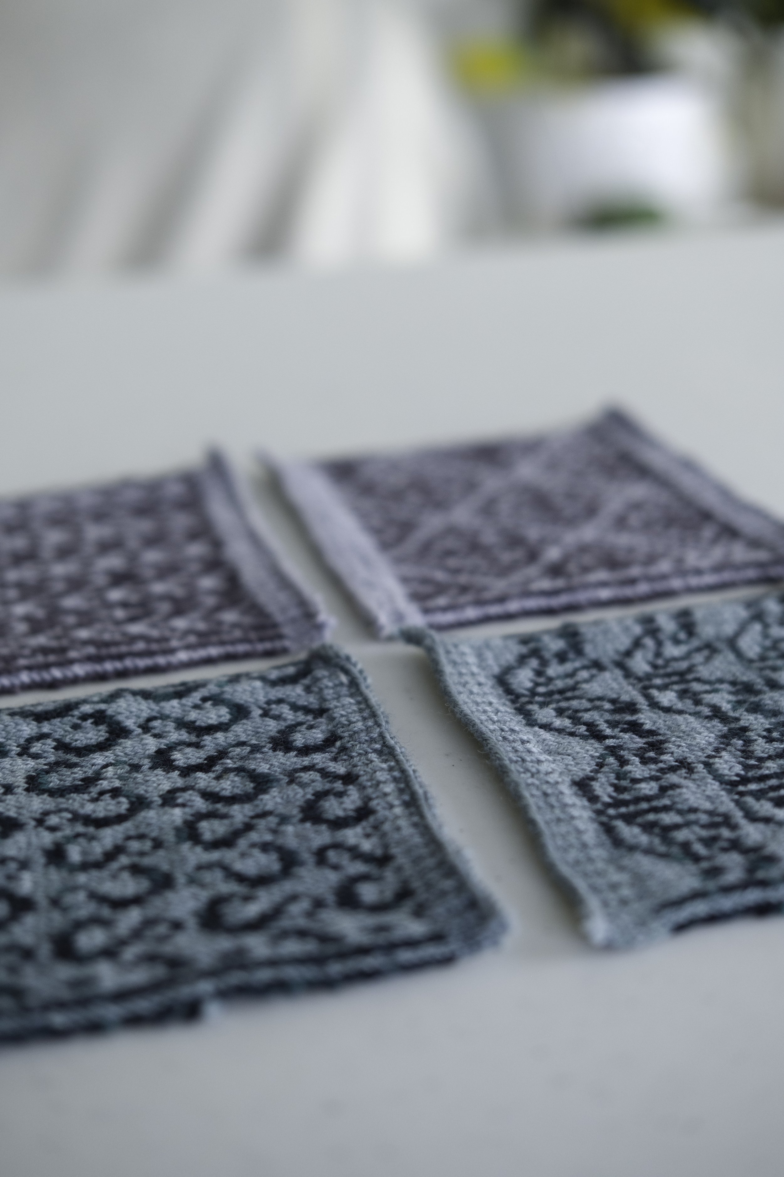
A splayed-out pile of colourful swatches with different colourwork motifs. The pile shows both semi-solid and solid yarn colours. All the motifs have a paler coloured background with a darker pattern colour.
When using variegated yarns, I like to choose a contrasting colour that doesn’t include any of the shades or values featured in the variegated yarn. That can make choosing yarns a little bit more difficult, especially if your variegated yarn is very colourful or has a bunch of light and dark values. But if some of the shades and values in the variegated yarn match the contrast colour, you’ll have spots where your pattern disappears. That can be artsy and a valid creative choice! Just be purposeful so that you’re not disappointed by the result. To get the best out of variegated yarns, I suggest choosing a variegated colourway that’s pretty much all light or all dark and a contrast colour that’s the opposite.
Speckled yarn can also be very fun to play with in colourwork, but keep in mind that if the speckles are the same shade or value as your contrast colour, you’ll probably have spots where the pattern is less distinguishable.
See the photos below for examples of semi-solid and variegated yarns worked into colourwork projects.
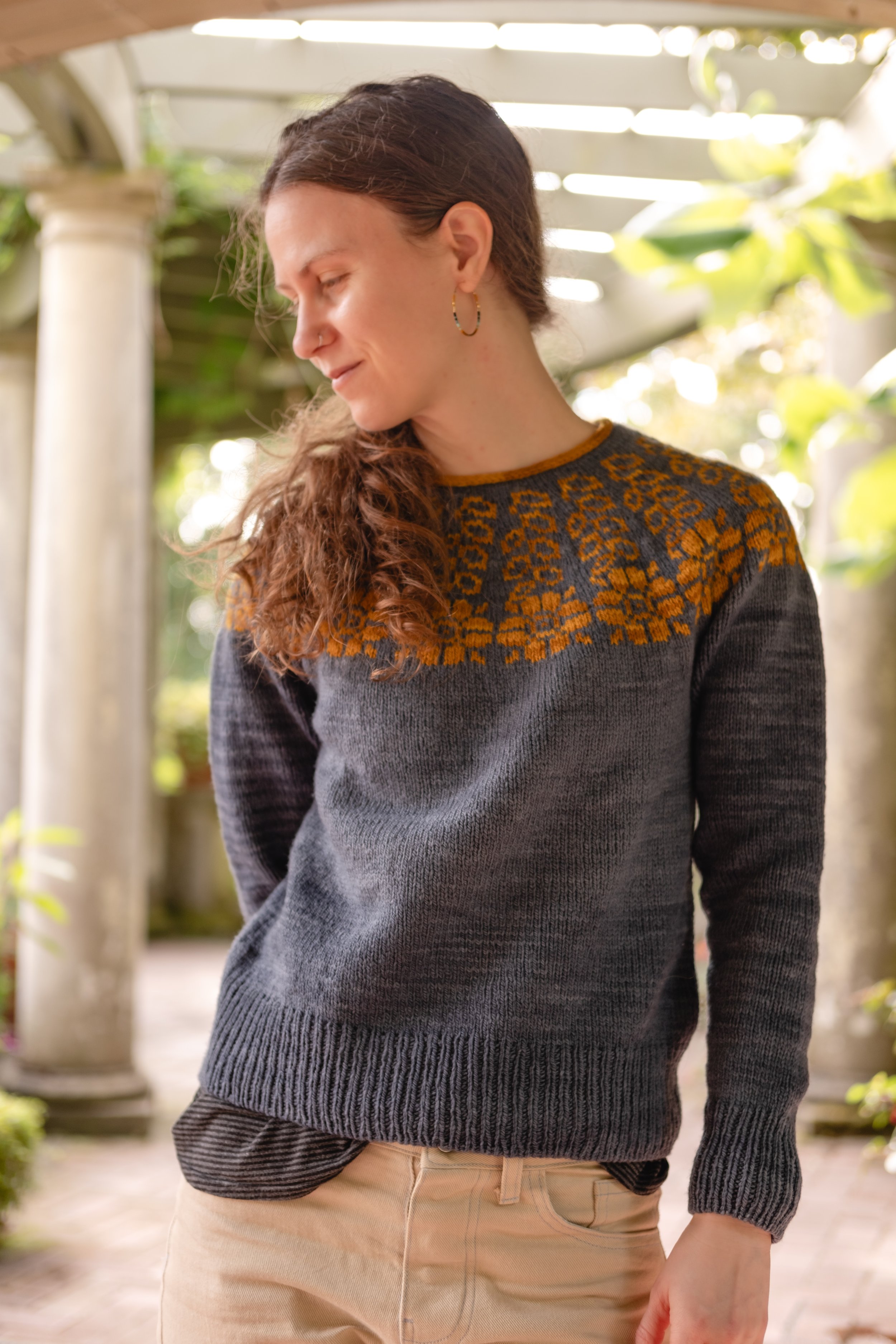
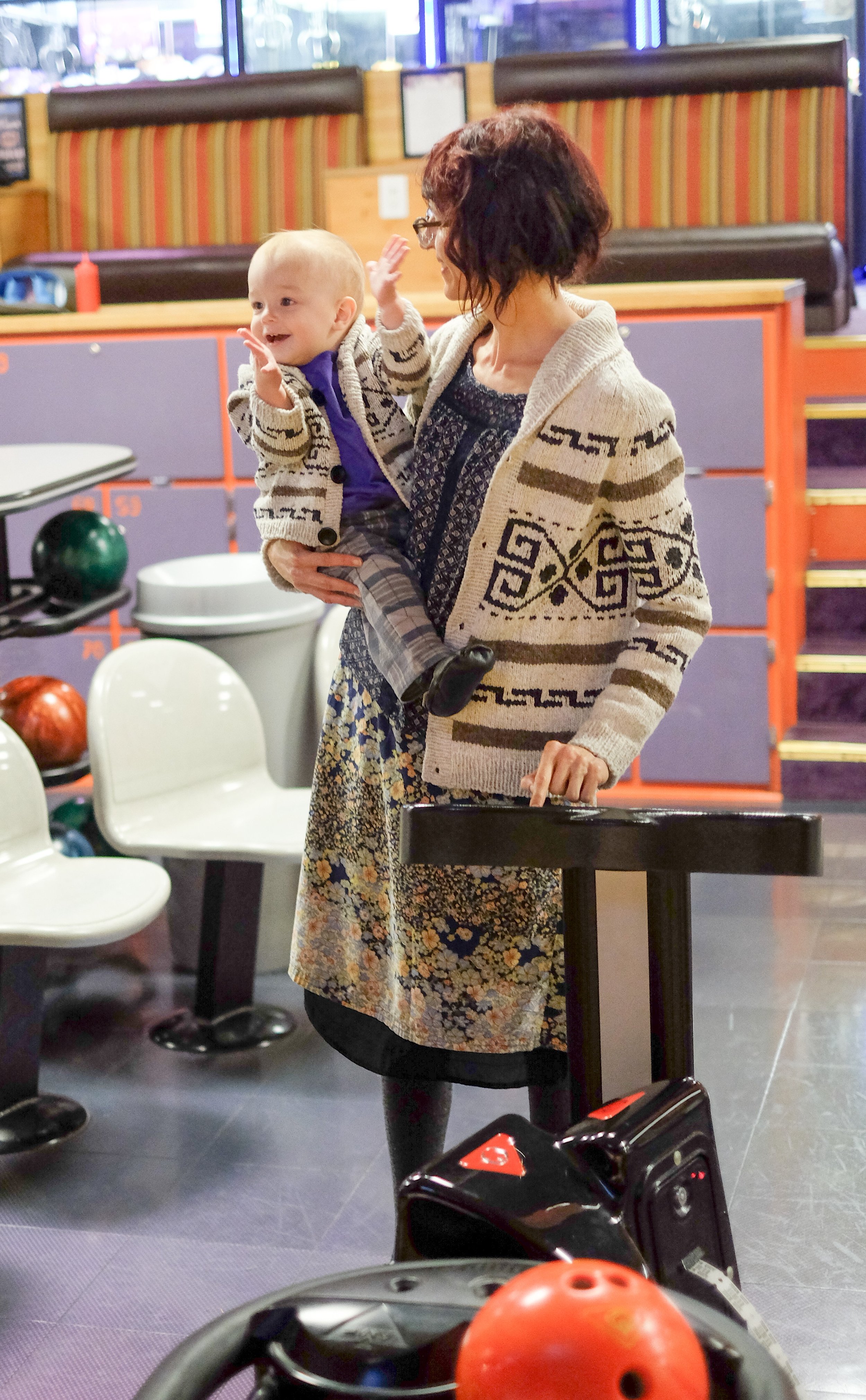
Andrea standing in a patio with grand pillars. She’s wearing her Midnight Garden pullover in dark grey with gold flowers draped around the yoke.
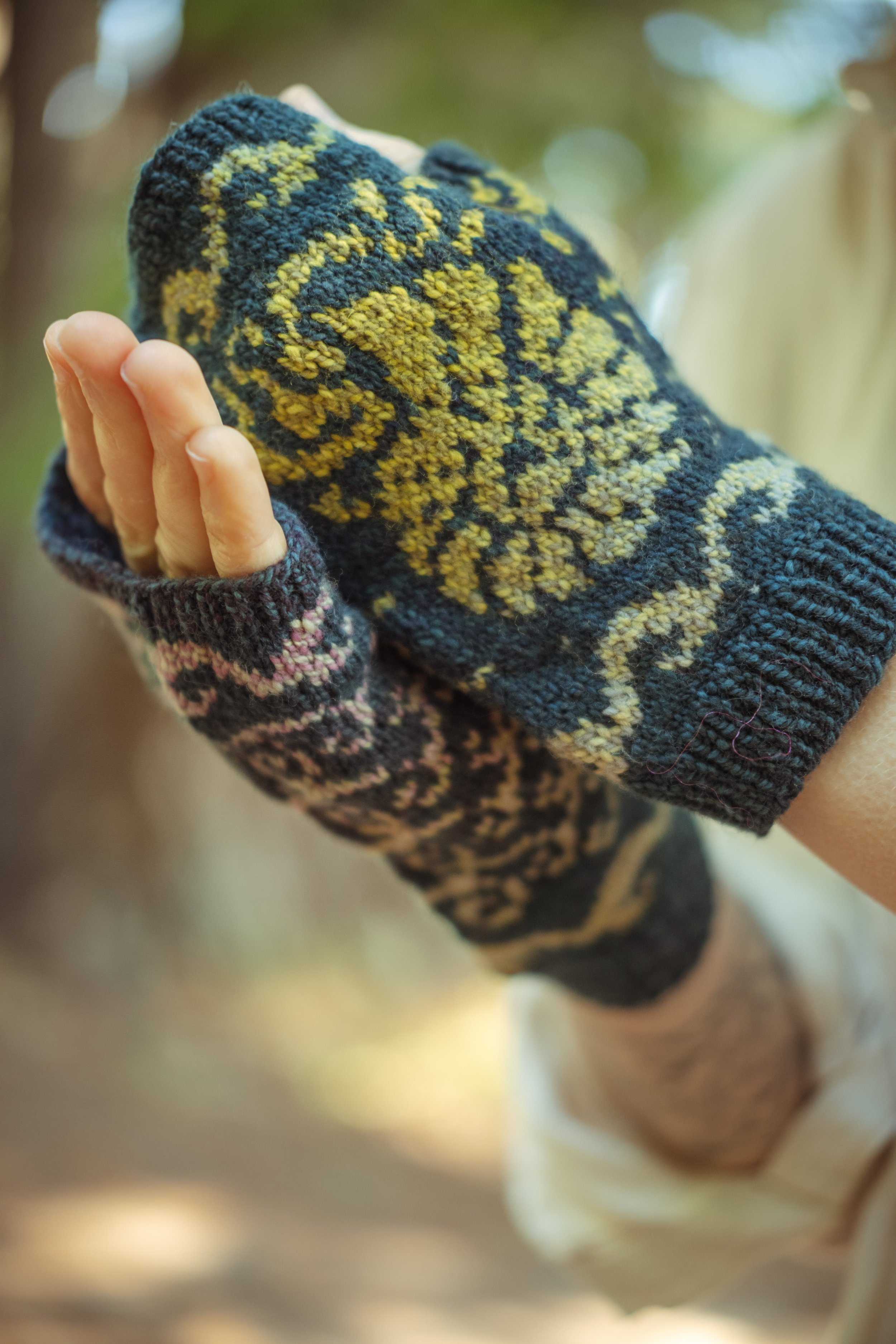
Closeup of Andrea’s hands wearing Nautilus Mitts. The background colour is deep blue and the pattern colour is a variegated yarn in pale shades of gold, teal, and purple.
JA Team:
You have a new book, KnitOvation Stitch Dictionary, out - Congratulations! Can you tell us more about the new swatches made for this project? How do they relate and complement with the swatches made for your previous book - AlterKnit Stitch Dictionary?
Andrea:
Thank you! KnitOvation is a companion book to AlterKnit, so it’s got a similar vibe. It includes over 150 new motifs for knitters to play with and expand their custom colourwork knitting options. Along with the motifs, there’s a chapter that explores 17 different yarns, all knit in the same colourwork motif so knitters can get a feel for what a difference fibre, construction, plies, weight, and colour can make.
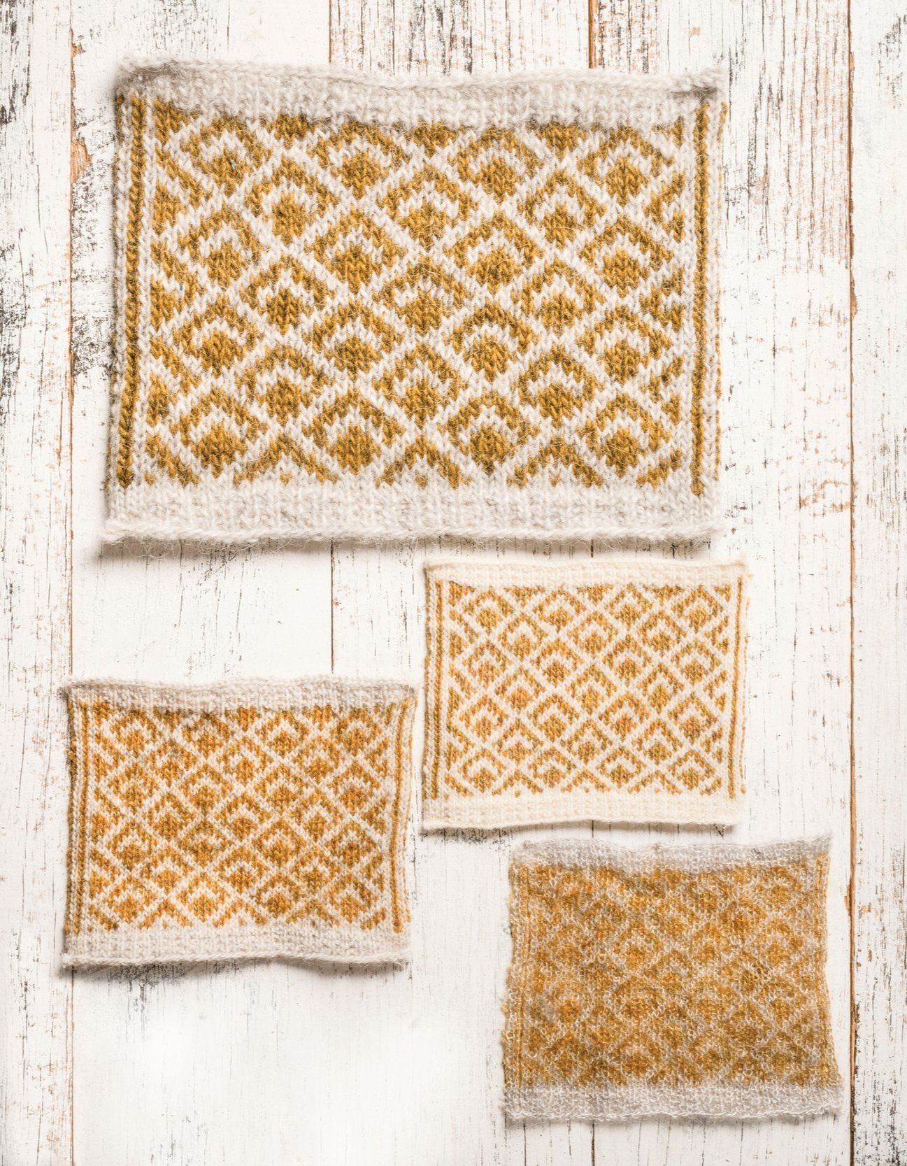
White and gold swatches in the Pavo colourwork motif that’s reminiscent of peacock feathers. They’re all different sizes and in different yarns. The top one is worked in Istex Letlopi, the middle, right one is in Julie Asselin Nurtured Fine, the bottom right one is in Julie Asselin Anatolia, and the left middle one is in Nurtured Fine held with Anatolia.
KnitOvation also includes three new projects that combine different motifs and explain the design process so knitters can use the projects as jumping-off points for their own work. My hope is that knitters and designers use both books together as toolkits for their personal explorations.
And because folks always wonder, yes, the motifs in both books can be used by designers in paid patterns without credit to me! The books are like any other stitch dictionary in that way.
Thanks so much for your questions! Happy colourwork knitting!
Have you made anything from KnitOvation or AlterKnit Stitch Dictionaries? Tell me about it in the comments~
You Might Also Like
The Royal We Ebook
Buy KnitOvation Stitch Dictionary
Dissent Pullover Pattern