Some designs don't get published
The Technical Details of how I Designed A Garden Wedding
After knitting the last stitch of the row in bright poppy red, I spread out the big, half circle of lace I’d been knitting. On my lap it looked promising, but not quite there. To know for sure what to do next, I knew I’d need to get a better look, a full overview by steaming the fabric since lace looks like a wadded up piece of paper before it’s been blocked. So I got out my mini steamer, filled it with water, and flipped the switch up. While waiting for it to boil, I draped the lace, still on a long needle cord, over a chair. Then, when I heard the rumble of the boil, I applied big puffs of hot steam, watching the fabric relax like magic as I waved the steamer like a wand over it.
The design was intended to be a half pi shawl reminiscent of a big flower. It would have a delicate, petal-filled centre, a wider bit with a swirling look like sunflower seeds, and then big, lacy petals around the edge. The yarn was a gradient, flowing from yellow to green to a big stretch of blue and finishing off with a bold pinkish red.
I could see already that, while it delighted me, it was not a good design. My next step was to figure out why.
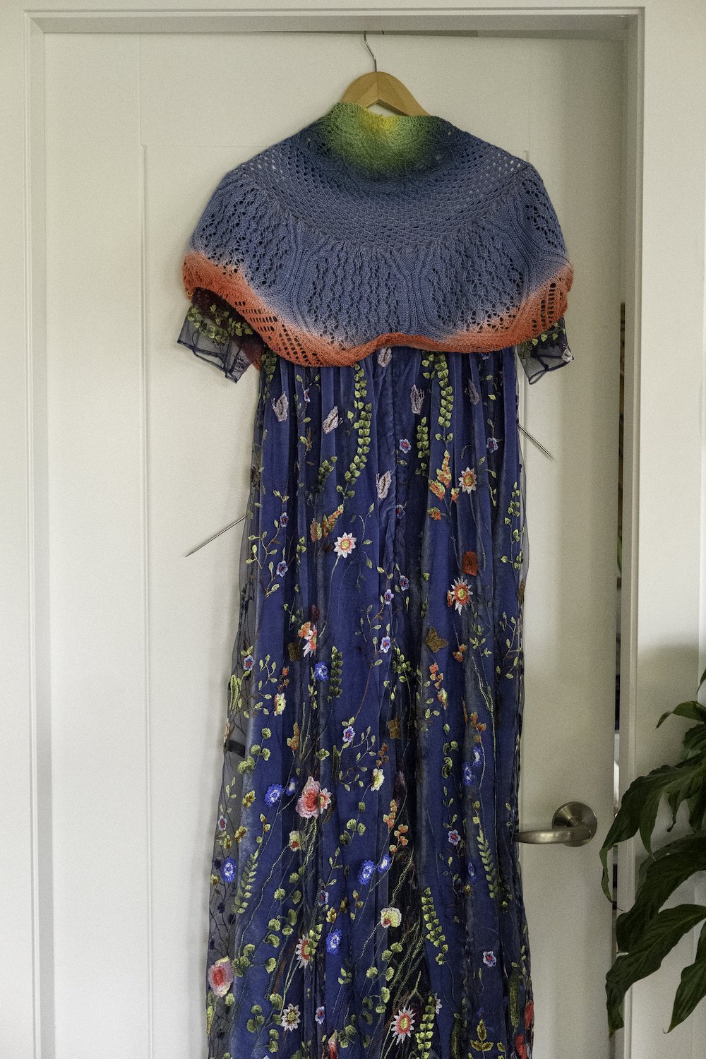
An unfinished lace half pi shawl is draped over an embroidered gown. The shawl is shades of yellow, green, blue, and red.
To get a feel for how I wanted to use the project once it was finished, I pulled a flowing velvet and embroidered tulle gown out of the closet, hung it on the back of a door, and then wrapped the lace around the shoulders of the dress. I could see already that it was way too much -- too many colours, too many patterns, far too busy. So the most important fix would be to simplify. I took photos, put my camera down, and stared at the swatch. Then I stared at the photos. Chances are I put everything away so I could come at it with a fresh perspective the next day, but it’s also possible I could have just mulled it over for hours more.
The next step was to get some feedback, so I sent a picture to Catherine at Gauge Dye Works who’d dyed the yarn to perfectly match my dress. And I got on the phone with my sister Jenni. I was making the shawl to wear to her wedding and she has a great eye for clothes, so I wanted her opinion too. We all agreed that it didn’t work as it was and I think Jenni said it was a bit more “carnival” than “garden wedding”.
It’s extremely rare that I conceive of an idea, swatch it up, and immediately think, “That’s it! Great job!” So it wasn’t a surprise that this first concept was a bust.
The challenge was to know whether to keep pursuing it or to drop it and try something completely different.
Before I’d tried the lace, I’d swatched a leafy cable pattern that didn’t quite work with my lace half pi idea. I tried incorporating it a bit by modifying it to have narrower lines, but the result wasn’t great. The problem with using a standard cable pattern in a half pi shawl is that cables draw in dramatically. Most half pi shawls rely on the stretchiness of lace to achieve that shape, so a stitch pattern that pulls all the fabric tighter just won’t work without adjusting the number of stitches or doing some other kind of dramatic fussing about.

Two blue knit swatches in a cable and lace motif. The one on the left is worked in worsted weight yarn so it’s much bigger than the one on the right, worked in fingering weight yarn. They’re slightly different shades of blue.
But that cable motif really was just perfect. It had elegant, swirling ropes that framed delicate lace leaves like vines on a garden gate. The love for that motif brought me back to the drawing board. If a half pi shape wasn’t the thing, what would work? I went back to my inspirational Pinterest board to get my ideas flowing and was reminded of piano shawls, huge squares of fabric with a swishy fringe all the way around. They usually have some kind of floral motif and are worn folded in half so they look like triangles.
I pulled up ProCreate, the drawing app I use on my iPad, and sketched up a design for a piano-shawl inspired wrap. Instead of a square, I went ahead and just made it a triangle since that’s how it would be worn anyway, and I added big flowers to the edge. The rest of the shawl would be just that elegant cable and leaf lace motif repeated all over the fabric. And yes, my sketch included the fringe! Since I’d learned the lesson from my lace swatch that all those colours were way too loud, I decided to stick with a gentle blue gradient and pink flowers to mimic my favourite embroidered ones on my dress.
Original Concept Sketch

Colourful sketch of a half pi shawl with a mandala look. The colours are yellow, green, blue, and red.
Actual Design Sketch

Collage with a sketch of a blue triangle shawl with pink flowers, a blue cabled swatch, and a blue swatch with red and pink flowers.
This is one of the stages that I love about working with Catherine -- if I come up with a new idea, we talk it over and then she makes yarn that’s exactly what I need to make my vision happen!
With my gorgeous blue gradient yarn in hand, I cast on the centre of a top-down/centre-out triangle shawl. I should say that at this point I was working with fingering weight cashmere/Merino/nylon yarn. It was very soft and very beautiful. I’ll tell you later why I didn’t end up using it.
As I worked my triangle, getting into the fascinating rhythm of cable crosses, decreases, and yarn-overs, it became clear that I was not making a triangle. The sides sort of angled inwards so that instead of a flat top centre, it came to a point at the cast-on spot.
A standard top-down/centre-out triangle shawl works by starting with a small number of stitches around a garter tab and then increasing 4 stitches every right side row. With a lot of knitted fabric, that creates the triangle shape. But remember how I mentioned that cabled fabric draws in a lot? Well, it draws in so much that it was not creating my desired triangle at all. One way to fix that problem is to have more increases. Instead of just increasing every right side row, you’d need to increase on some of the wrong side rows as well. It’s an elegant and easy solution.
But when I opened up Adobe Illustrator to add those increases to my chart, I realized that my straightforward solution created a challenge. I’d been able to modify the cable and lace motif so that it grew from just a few stitches outward with ropey cables framing the edges of the two triangles making up the main body of the shawl. But the cables did not grow at the same rate as I needed for the increases. That meant that I couldn’t create a couple of neat little repeating charts, but would instead need large charts that showed both the changes in the cable and lace bits and the changes in the edges. I took a break at that point, wondering if that was just too extra to publish.
Sometimes these moments hit in the design process. What do you do when things aren’t straightforward? When I publish a pattern, one of my goals is that it’s a joy to work with. I want knitters to feel inspired, not intimidated. So charts that big posed a logistical problem. How could I make them joyful?
And it’s almost always my goal to include both written and charted instructions for motifs so that knitters with all kinds of preferences can use them without having to put up with a method they don’t like. Would written instructions be practical for charts this large? Would it be okay to omit them for a project like this?
And I had another concern too -- the colourwork. I do not enjoy working colourwork back and forth in rows. Working in the round and then cutting it open if it must be flat is almost always better. But the top edge of a shawl like this is so important too. I wanted it clean and smooth, not bulky, which would be inevitable if I reinforced and cut the edge. I considered just working the colourwork section in the round, and the rest flat, but the thought of the edge abruptly changing at the colourwork section was horrifying. So it would have to be knit flat.
Some patterns just don’t get published. Things we make for ourselves aren’t always for everyone else and that’s okay. Some motifs are perfect for one size sweater, but impossible to split up into small enough segments to make more than a few sizes with enormous gaps in between them.
Since this is my job, I can’t just focus on the creative joy I feel. It’s important that I also constantly consider the experience I’m sharing with other knitters too.
I already knew this project would not be a normal collaboration for me and Catherine. Because we usually love to create secret yarn and pattern clubs, it’s important that our work is approachable to a wide variety of knitters. In previous collaborations our goal has been to create one- or two-skein projects with simple construction and spicy element or two to keep it exciting.
This shawl was already breaking all those rules by being a much bigger shawl with some more advanced techniques. But after talking it over, we decided to go for it. We figured that as long as we let folks know what they’re in for and remove that surprise element, the knitters who this is for would find it. For folks who prefer our usual method, we’ll be back with more of those kinds of designs for sure!
So how did I square those challenges? What did I do about the big charts and the back-and-forth colourwork so that this project would be joyful for my knitters?
I decided to leave out written instructions for the charts. Written instructions are a lot more time-consuming than charts and they’re very error-prone. Even with the best editors and testers, things can be missed when there are this many rows. It’s important to me that my patterns be error-free and easy to use.
Creating written instructions is a big finanancial investment of my time and the time I pay my editors for and I think that most folks knitting a project like this would want charts.
But if you’re a person who’s lamenting my choice, will you let me know? I price my patterns in a way that pays me fairly and allows me to pay everyone I work with fairly, but I want to serve my customers, so if you’re a row-by-row only person who would have knit this shawl if it weren’t for the charted-only aspect, I want to know about that so I can be informed about what folks want for future projects. You can email me here or post in the comments.
To make the big charts more approachable and easy to use, I included colour coding. I was told by my testers that the colours helped them know what to do at a glance so they were much less likely to need to check the key carefully every time. And if you’re printing in grey scale, you’ll still be able to follow the charts, you just won’t have the quicker reference of the colours.
I also included something else I haven’t done before. I stuck a number in the first box of a long stretch of the same kind of stitch. So if you’re supposed to purl 13 stitches, the first box is grey with the number 13 in it. If you’re supposed to knit 10, the first box is white with the number 10 in it. That way you don’t have to sit there counting those long stretches of stitches to be sure you’ve done the correct number before switching to whatever comes next.
Some of you may have noticed that the numbers aren’t present in the colourwork charts, but the repeats just didn’t work out. I decided it would create more confusion than it solved to include the numbers in those charts.
And as for working the colourwork on the wrong side? Well, it’s eighteen rows, not the entire shawl, so I hope you can think of the need to slow down in this section as a chance to practice a skill (colourwork on the wrong side) and just enjoy watching the gradient develop. I included instructions on what to do about floats and I think they end up looking very pretty on the wrong side.

A small blue gradient textured triangle with pink flowers is draped over the back of a tulle and velvet gown.
To finish the story of this design, after creating a tiny textured triangle with sweet pink flowers and deciding it was perfect, Catherine suggested I might want to think about making the shawl in worsted weight instead of fingering.
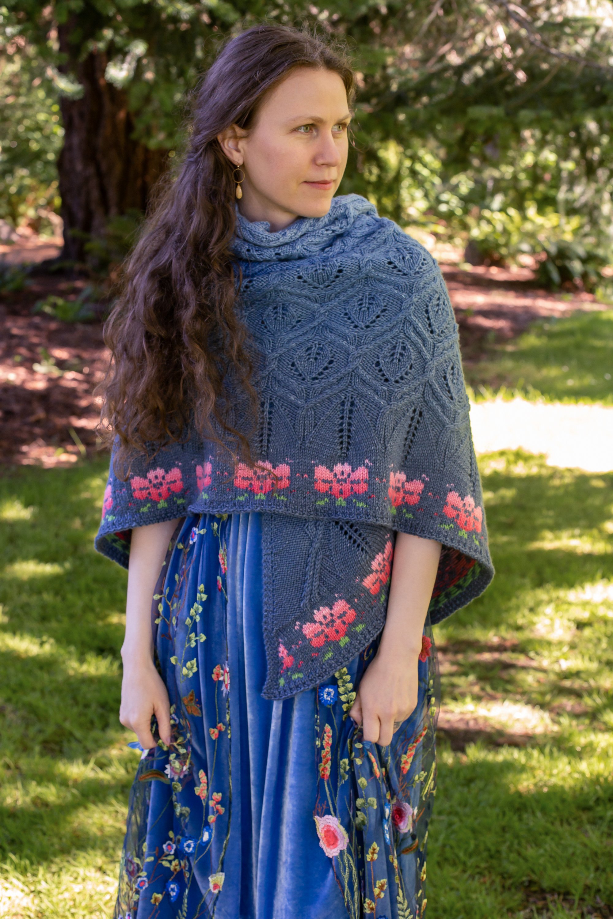
And she was right. I switched to a heavier yarn and left out the cashmere and ended up with a texture that I just can’t stop looking at. The cables pop like tiny raised sculptures and I love the boldness of the big flowers. I had my shawl finished in time to wear it to my sister Jenni’s wedding (see wedding pictures here!) and we even published the pattern in two sizes and the yarn kits so you all can enjoy them too.
Pattern design is a balance. How do I make something that embodies my creative vision while also being approachable and joyful for others? In this case I know I leaned way towards that embodying my vision and away from “approachable”, but I hope that for those of you who are thrilled by epic knitting, this turned out to be as joyful for you as it has been for me.

Closeup of Andrea's shoulder viewed from the side with an intricately cabled blue gradient shawl wrapped around her. There are gradient pink flowers along the edge.
This is the epic heirloom project you’ve been waiting for.
My sister Jenni’s sewing projects are elaborate. Think lush velvet renaissance gowns, extravagant silk tailcoats and bustled wedding dresses. So when she told me she was getting married I knew the clothes would be incredible, and, after sewing my own embellished bridesmaid gown, I set about designing an elegant shawl to complete the look. I collaborated with Gauge Dye Works to make yarn with a stunning blue gradient and floral pink that perfectly matches the embroidery on my dress and reflects the floral garden theme of Jenni’s wedding. When you wrap this exquisite heirloom around your shoulders, you’ll feel the cozy sense of accomplishment that comes from knitting something spectacular.
Get the yarn specially created for this pattern by Catherine at Gauge Dye Works.
You Might Also Like

You Need an Epic Project

Alterknit Stitch Dictionary

Favourite Florals